Difference Between Histogram And Bar Chart
Juapaving
Mar 16, 2025 · 6 min read
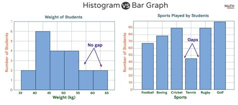
Table of Contents
Histograms vs. Bar Charts: A Deep Dive into Data Visualization
Data visualization is crucial for understanding and communicating insights from data. Two popular choices for displaying data are histograms and bar charts. While they might appear similar at first glance, understanding their key differences is vital for choosing the right tool for your specific data and analytical goals. This comprehensive guide will explore the nuances of histograms and bar charts, helping you select the most effective visualization method for your needs.
Understanding Histograms: Visualizing Data Distribution
A histogram is a powerful graphical representation of the distribution of numerical data. It displays the frequency of data points falling within predefined intervals or bins. Unlike bar charts, which represent categorical data, histograms focus on showcasing the shape, spread, and central tendency of continuous data.
Key Characteristics of Histograms:
- Continuous Data: Histograms are specifically designed for displaying continuous data, such as height, weight, temperature, or income. The data is not discrete; it can take on any value within a range.
- Bins/Intervals: The horizontal axis represents the range of the data, divided into intervals or bins. Each bin represents a specific range of values.
- Frequency: The vertical axis shows the frequency (or count) of data points that fall within each bin. Taller bars indicate a higher concentration of data points in that specific range.
- No Gaps Between Bars: A crucial difference from bar charts is that the bars in a histogram are adjacent to each other, with no gaps. This visual representation emphasizes the continuous nature of the data.
- Shape of the Distribution: Histograms reveal the shape of the data distribution, such as normal (bell-shaped), skewed (right or left), uniform, or bimodal. This information is critical for understanding the underlying patterns in your data.
When to Use a Histogram:
- Exploring the Distribution of Continuous Data: Histograms are ideal for understanding the overall distribution of your continuous data. Are the data points clustered around a central value, or are they spread out? Are there any outliers?
- Identifying Outliers: Histograms can help you easily identify potential outliers, data points that lie significantly outside the typical range of values.
- Assessing Normality: The shape of the histogram helps determine whether the data approximates a normal distribution, which is important for many statistical analyses.
- Comparing Distributions: You can use histograms to compare the distributions of continuous data from different groups or samples.
Understanding Bar Charts: Representing Categorical Data
A bar chart is a visual representation of categorical data. It uses rectangular bars to display the frequency or values of different categories. Unlike histograms, which represent continuous data, bar charts show discrete, non-overlapping categories.
Key Characteristics of Bar Charts:
- Categorical Data: Bar charts are used to represent categorical data, such as colors, types of fruits, countries, or gender. The categories are distinct and separate.
- Bars Represent Categories: Each bar corresponds to a specific category, and the length of the bar represents its frequency or value.
- Gaps Between Bars: A key distinguishing feature is the presence of gaps between the bars. These gaps emphasize the distinctness of the categories.
- Comparison of Categories: Bar charts are excellent for comparing the frequencies or values of different categories.
- Vertical or Horizontal: Bar charts can be oriented vertically (vertical bar chart) or horizontally (horizontal bar chart), depending on the preference and the amount of text associated with each category.
When to Use a Bar Chart:
- Comparing Categories: Bar charts are effective for comparing the frequencies or values of different categories. For example, you can compare sales figures across different product lines or the number of students enrolled in different courses.
- Showing Proportions: Bar charts can be normalized to show proportions or percentages within a whole. For instance, you could display the market share of different brands.
- Presenting Discrete Data: When dealing with discrete data with distinct categories, bar charts are the ideal choice.
Key Differences Between Histograms and Bar Charts: Summarized
The table below highlights the key differences between histograms and bar charts:
| Feature | Histogram | Bar Chart |
|---|---|---|
| Data Type | Continuous | Categorical |
| X-axis | Range of values (bins) | Categories |
| Y-axis | Frequency (count) of data points in bins | Frequency or values of categories |
| Bars | Adjacent, no gaps | Separated by gaps |
| Purpose | Show data distribution, identify outliers | Compare categories, show proportions |
| Example | Distribution of heights in a population | Sales of different products in a store |
Beyond the Basics: Variations and Considerations
While the core distinctions between histograms and bar charts are clear, there are some variations and nuances to consider:
1. Frequency vs. Relative Frequency:
Both histograms and bar charts can be created using either frequency (counts) or relative frequency (percentages) on the vertical axis. Relative frequency is particularly useful for comparing distributions with different sample sizes.
2. Stacked Bar Charts:
In certain situations, you might use a stacked bar chart, which combines the features of a bar chart and a pie chart to display multiple categories within each bar. This is particularly useful for displaying proportions of different categories across different groups.
3. Using Histograms for Quality Control:
In quality control, histograms are frequently used to analyze the distribution of measurements taken from a production process. This allows quality engineers to identify potential issues in the process and implement corrective actions.
4. Choosing the Right Bin Size in Histograms:
The choice of bin size in a histogram affects its appearance. Too few bins can obscure important details, while too many bins can make the histogram appear noisy and difficult to interpret. Experiment with different bin sizes to find the optimal balance.
5. Data Transformations:
Sometimes, data transformations (like logarithmic scales) can be applied to improve the readability and clarity of histograms, especially when dealing with skewed data distributions.
Advanced Applications and Considerations:
Histograms and bar charts are fundamental tools, but their application extends far beyond basic data summaries:
1. Kernel Density Estimation:
For smoother representations of data distribution, kernel density estimation can be applied to histograms, resulting in a smoother curve that estimates the underlying probability density function.
2. Comparative Histograms:
Overlaying multiple histograms on the same plot allows for direct comparison of the distributions of different groups or samples.
3. Interactive Visualizations:
Modern data visualization tools allow for interactive histograms and bar charts, enabling users to explore the data in more detail by hovering over bars or zooming in specific regions.
4. Histograms in Statistical Analysis:
Histograms play a crucial role in various statistical analyses, including hypothesis testing, parameter estimation, and model fitting. They help visualise the data and guide the choice of appropriate statistical models.
Conclusion: Selecting the Right Visualization
The choice between a histogram and a bar chart depends entirely on the nature of your data and your analytical goals. If you're working with continuous data and want to understand its distribution, a histogram is the appropriate choice. If you have categorical data and want to compare frequencies or values across different categories, a bar chart is the better option. Understanding the key differences and the various options available will allow you to create effective and insightful visualizations that communicate your data effectively. Remember, the goal of data visualization is to make complex data easier to understand, and choosing the right chart is the first step toward achieving that goal.
Latest Posts
Latest Posts
-
How Many Symmetry Lines Does A Square Have
Mar 17, 2025
-
Do Viruses Belong To One Of The Domains Of Life
Mar 17, 2025
-
The C Shape Of The Tracheal Cartilages Is Important Because
Mar 17, 2025
-
Least Common Multiple Of 5 6 7
Mar 17, 2025
-
How Do You Find The Inverse Of A Relation
Mar 17, 2025
Related Post
Thank you for visiting our website which covers about Difference Between Histogram And Bar Chart . We hope the information provided has been useful to you. Feel free to contact us if you have any questions or need further assistance. See you next time and don't miss to bookmark.
