Are Histograms And Bar Graphs The Same
Juapaving
Apr 01, 2025 · 6 min read
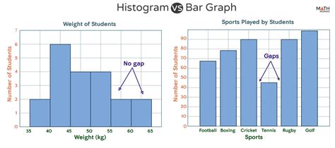
Table of Contents
Are Histograms and Bar Graphs the Same? A Deep Dive into Data Visualization
Histograms and bar graphs are both popular tools for visualizing data, and at first glance, they might seem interchangeable. Both use rectangular bars to represent data, leading to frequent confusion. However, a closer examination reveals crucial differences in their purpose, construction, and interpretation. This article will delve deep into the distinctions between histograms and bar graphs, clarifying their applications and helping you choose the right chart for your data.
Understanding the Fundamentals: Histograms vs. Bar Graphs
While both use bars to represent data, the fundamental difference lies in what those bars represent.
Bar graphs, also known as bar charts, display the frequency or count of categorical data. The categories are clearly defined and distinct, and the height of each bar corresponds to the number of data points falling into that category. Think of it like a tally chart turned into a visual representation.
Histograms, on the other hand, represent the frequency distribution of numerical data. They show how often data points fall within specific intervals or bins. Unlike bar graphs, the categories in a histogram are not distinct but rather continuous ranges of values. The width of each bar represents the range of the interval, and the height represents the frequency of data points within that range.
Key Differences: A Comparative Analysis
Here's a table summarizing the key differences:
| Feature | Histogram | Bar Graph |
|---|---|---|
| Data Type | Numerical (continuous or discrete) | Categorical (nominal or ordinal) |
| X-axis | Numerical intervals (bins) | Categories |
| Y-axis | Frequency (count or percentage) | Frequency (count or percentage) |
| Bar Spacing | Bars are adjacent (no gaps) | Bars are separated by gaps |
| Purpose | Show data distribution and shape | Compare frequencies of different categories |
| Order of Bars | Determined by the numerical intervals | Can be ordered alphabetically, chronologically, or by frequency |
Data Representation: A Visual Illustration
Imagine you have data on the heights of students in a class.
Bar Graph Scenario: If you want to compare the number of students in different height categories (e.g., short, medium, tall), you would use a bar graph. Each bar would represent one category, and its height would show the number of students in that category. The categories are distinct and separate.
Histogram Scenario: If you want to visualize the distribution of heights across a range of values, showing how many students fall within specific height intervals (e.g., 50-55 inches, 55-60 inches, 60-65 inches), you would use a histogram. The bars would be adjacent, representing continuous intervals, and the height would show the number of students within each interval.
Choosing the Right Chart: A Practical Guide
The choice between a histogram and a bar graph depends entirely on the nature of your data and the insights you want to convey.
Use a bar graph when:
- You have categorical data (e.g., colors, types, brands).
- You want to compare the frequencies of different categories.
- You need to clearly distinguish between discrete categories.
- You want a simple and easily understandable visualization.
Use a histogram when:
- You have numerical data (e.g., measurements, scores, ages).
- You want to visualize the distribution of the data.
- You want to identify patterns like skewness, symmetry, or modality.
- You need to understand the frequency of data within specific ranges.
- You are interested in statistical measures such as mean, median, and mode.
Beyond the Basics: Advanced Considerations
While the core distinctions are clear, several nuances can further differentiate histograms and bar graphs.
1. Bin Width in Histograms:
The choice of bin width in a histogram significantly impacts its appearance and interpretation. Too few bins can obscure important details, while too many bins can make the histogram appear cluttered and less informative. Experimentation and consideration of the data's range and distribution are crucial for selecting an appropriate bin width. Common approaches include Sturges' rule and the Freedman-Diaconis rule, which offer formulas for calculating optimal bin widths based on the number of data points and data range.
2. Frequency vs. Relative Frequency:
Both histograms and bar graphs can display either the absolute frequency (count) or the relative frequency (percentage) of data points. Relative frequency is particularly useful when comparing datasets of different sizes, allowing for a standardized comparison of proportions.
3. Cumulative Frequency Histograms:
A cumulative frequency histogram displays the cumulative frequency of data points up to a specific value. This type of histogram is useful for understanding the proportion of data points below a certain threshold. It's commonly used to illustrate percentiles and quantiles. This is not a feature typically seen in bar graphs.
4. Stacked and Grouped Bar Graphs:
Bar graphs offer more flexibility in presentation. You can create stacked bar graphs, which are helpful for displaying the composition of multiple categories within a larger category, or grouped bar graphs, which are useful for comparing multiple categories across different groups. These variations aren't directly applicable to histograms.
5. Data Outliers and Their Impact:
Outliers—data points significantly different from the rest—can heavily influence the interpretation of both histograms and bar graphs. In histograms, outliers might create a long tail, distorting the perception of the data's central tendency. In bar graphs, an outlier might simply create an unusually tall bar. Careful attention to outliers and consideration of their potential impact is crucial for a fair and accurate data visualization.
Advanced Applications and Software
Histograms and bar graphs are fundamental tools utilized across various fields, including statistics, data analysis, and data science. They find applications in analyzing sales figures, student performance, weather patterns, and countless other scenarios. Many software packages excel in creating these visualizations. Software like Excel, R, Python (with libraries like Matplotlib and Seaborn), and specialized statistical software readily generate both histograms and bar graphs with customizable features, allowing for fine-tuned visual representations that meet specific analytical needs. The choice of software depends heavily on user familiarity and the complexity of the analysis involved.
Conclusion: Avoiding Misinterpretations and Ensuring Clarity
While histograms and bar graphs share a visual similarity, their fundamental differences in data type and purpose are crucial to understand. Using the wrong chart type can lead to misinterpretations and inaccurate conclusions. This detailed comparison serves as a guide to help you choose the appropriate chart for your data, ensuring clear and effective communication of your findings. Remember, the goal of data visualization is to reveal meaningful patterns and insights, and selecting the right chart type is a critical step in achieving this goal. By carefully considering the nature of your data and the message you want to convey, you can harness the power of both histograms and bar graphs to present your data effectively and accurately.
Latest Posts
Latest Posts
-
200 Inches Is How Many Feet
Apr 02, 2025
-
Is Boiling A Physical Or Chemical Change
Apr 02, 2025
-
Rectangle Has How Many Lines Of Symmetry
Apr 02, 2025
-
How To Find Recoil In Physics
Apr 02, 2025
-
87 Inches Is How Many Feet
Apr 02, 2025
Related Post
Thank you for visiting our website which covers about Are Histograms And Bar Graphs The Same . We hope the information provided has been useful to you. Feel free to contact us if you have any questions or need further assistance. See you next time and don't miss to bookmark.
